Recent research on the Internet has led me into the amazingly artistic world of vintage wooden-crate labels. This “crate art,” as it is generally known, refers to those colorful and eye-catching paper labels that agricultural growers once used to identify their fruit and veggie produce boxes. These artful little beauties served as a very early form of commercial advertising—and if they interest you as much as they interest me, then a little background history is in order.
Back in the 1880’s, West Coast citrus fruit growers began to seriously compete with each other for both local markets and East Coast distribution. With the development of the trans-Continental rail network, farmers were able to ship fruits (and veggies, once refrigerated rail cars were invented) in wooden crates clear across the country. So, how could growers make their products stand out from the pack? Well, for nearly seventy-five years, brightly colored and dramatic paper labels were the answer. Thus, crate art was born.

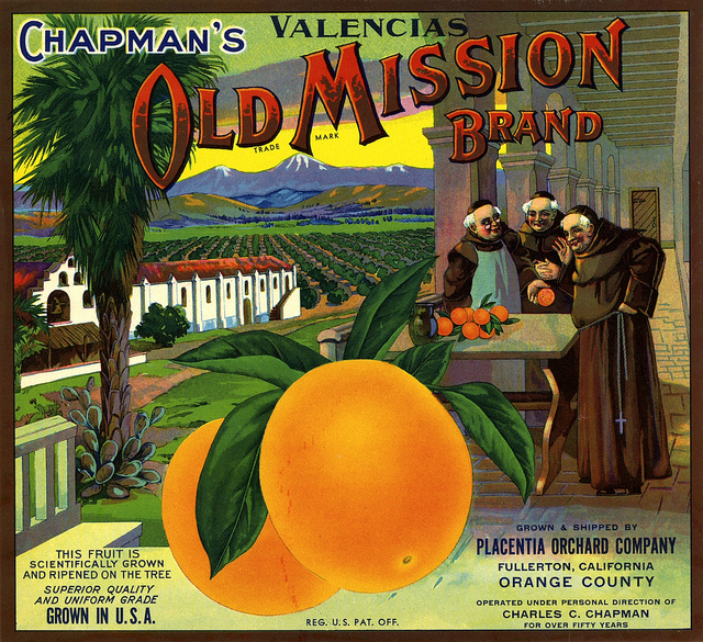
The artwork created for these labels was considered commercial—so although they were designed by many popular artists of the time, they remained unsigned. All labels were registered with the United States Department of Agriculture. Each label included the grower’s brand name, location, and what grade of product was being purchased.
Now, imagine how folks did their grocery shopping back then . . . it was definitely more in keeping with the farmer’s market concept of today. Families, merchants, and wholesale distributors alike would buy their fruit and vegetables right alongside the railroad tracks. The produce would be displayed in wooden shipping crates, usually under a tent or tin-roofed structure. So, how to sell a beautiful crate of oranges or lemons?

Well, it was all about the advertising, of course! Each crate would feature the grower’s distinctive label—sometimes up to one foot square—with a bright, colorful, eye-popping design. A memorable paper label soon became an agricultural grower’s most important advertising device to show the nation . . . and even the world.
Now these labels have a bit of interesting artistic history themselves. There were actually 3 styles—depending on when they were created. The early Naturalism style (1885-1930s) was done in the popular art of the day, and generally featured scenery, portraits, birds, animals, and flowers. California-based labels especially, focused on mountain and coastal ranges, fruit groves, and towns—often with such detail that specific landscapes and places could be easily identified.

The Advertising style (1930-1940s) instead went for “effect,” aiming to be recognizable from a distance. Labels in this style featured bright, simple images and strong messages. In wholesale auction yards or in the chaotic East Coast auction halls, crate labels had become the industry-wide means to quickly communicate what products were for sale. Buyers could not see fruit, in particular, because each piece was individually wrapped in tissue paper, then all were sealed in the wooden crate. Therefore, the more vivid and powerful the label image, the better the sales.

Then came the Commercial Art style (1940-1950s), which simply emphasized the brand name itself. Bold, three-dimensional block letters (often shadowed or contorted) and geometric designs were used to create brand recognition. Sometimes an image of the product itself was also incorporated into the design, but art was a secondary consideration . . . the idea was to have a marketing impact with a wall of crates that echoed one memorable brand name.
Throughout their heyday, crate labels included a wide range of themes: beautiful women, children, Indians, ferocious or cute animals, the Gold Rush, the Wild West, politics, holidays, and luscious vignettes of fruits or vegetables. Even though crate art had its beginning with the Southern California citrus industry, it went on to become a nationwide and worldwide produce marketing technique. It eventually stretched to other countries such as New Zealand, Australia, Japan, France, Chile, and more.
 Crate art labels were printed using stone lithography with 6, 8, or 12 color inks. San Francisco housed a huge lithography industry during the crate art craze and produced most of these labels.
Today, label art and the lithography houses that once created it are basically extinct. Grocery store clerks, like my dad—who, in the early 1950’s, was stocking produce in L.A.’s now-defunct “Boys” markets—most likely experienced the transition from fancy-labeled wooden crates to plain but cost-effective cardboard.  Not long after World War II, the shortage of metal and wood would lead to the invention of these pre-printed cardboard shipping boxes—thus spelling the end for the crate label business. When this happened, most of the paper labels were destroyed or placed in storage. The latter, when found in unused and excellent condition, are now the Holy Grail of crate art collectors, and they sell for good money. Framed labels are also a very popular form of vintage wall art.
Like this:
Like Loading...

 While gathering info and graphics for my recent post, Southern California’s Wooden Crate Art: Or the Romance of Fruits and Veggies, I set aside those crate labels that featured growers from the San Fernando Valley. And here they are.